Even if you haven’t heard the word heatmap, you’ve probably seen what a heatmap is without ever thinking about the potential uses.
Sure, we all check the weather on a daily, if not hourly, basis at times, but none of us ever think about what goes into collecting this data. A heatmap is a representation of that important weather data, which produces something similar to the graph below.
Furthermore, this attention to the visual serves to satisfy our more visceral tastes. This is especially true as around 5 billion people (about 63% of the world’s population) worldwide are using the internet today. With such a large community of online users, it’s no wonder why website owners are looking for tools to better their content and approach.

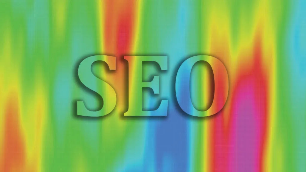
What are Heatmaps?
A heatmap is a color-coded data graph that represents different values. This aids users to visualize density and volume of an area, a webpage’s functionality, and even data pulled from a calendar. Heatmaps can be used to solve a slew of problems that website owners may come across. Some are looking for answers as to why their links are underperforming, while others are looking to know why there is a drop off in interest before the call-to-action.
We can look at a heatmap as the missing puzzle piece in a lot of situations. Website owners go through countless attempts of trial and error to create engaging pages, but still, sometimes pages just don’t perform as intended. The heatmap becomes more of a safeguard approach to physically see why a page could be underperforming.

What are Heatmaps used for?
While heatmaps are used for a variety of purposes, they have become essential components to understanding online users. A business can track the attention a page receives based on the colors from a heatmap.
For example, a heatmap can show how far a visitor may have scrolled before moving on to a new page. This can then inform researchers and businesses to better display content, entice visitors, and even reframe where the call-to-action should sit. Similarly, heatmaps have been used for epidemiological studies, financial reporting and company performance, and even in sports to identify patterns in a game or practice.
While many may assume that heatmaps are highly technical, and potentially difficult to read, they are actually easy to understand and quite useful as mentioned. The great benefit to using a heatmap often is due to its visual representation of something.
Whereas, other graph types become cumbersome to read or relay information, heatmaps are quite straightforward in design. The colors are generally represented in the same fashion across the board, which also makes it easy for those unfamiliar with data collection to grasp the concept.
How do Heatmaps Work?
Heatmaps are becoming increasingly popular options in content marketing, mainly for the highly intuitive features. The color scale generally shows warmer colors (like red and orange) for increased action and cooler colors (like blue and green) for less action in an area. While there are variations in color and design on individual heatmaps, most generally operate in similar ways. It’s quite literal in showing that there is increased attention to the brighter areas and less attention in the areas with little color. After collecting the data, marketers and even web designers can learn from what is shown.
For example, let’s say a page shows that some products are receiving less attention because they are far down the page. A designer can then infer that those products should perhaps be cycled up to the top to receive adequate attention. This is actually no different than how brick-and-mortar retailers do business. Many will move products around so that they will sell better. We are now just in a time of doing those physical things on digital platforms.

What You Can Learn From Heatmaps
Psychology practices and methodology are often top of mind for most professions.
This is not limited to medical or technical fields. In fact, most companies are looking for tools to better relate to and understand their intended audience. A heatmap serves as the bridge between the two. There’s a portion that serves to collect data and yield results, however, the other portion can be seen as insightful for understanding behavior.
Website owners can use heatmaps to see why a product isn’t selling, or why their page isn’t getting the follow through for email subscribers, which essentially all adds up to conversion. From small start-ups to large corporations, we are always wondering what leads to the best conversion.
Heatmaps have become clever tools for companies and website owners to collect data in a more tangible way than percentages and off-putting charts. As mentioned, a heatmap gives the physical element to performance by highlighting what works and what isn’t working.

Heatmaps Types and Uses
There are generally two categories of heatmaps that organize data based on two different criteria. While the uses differ on the website owner’s intention, they usually work to highlight an underperforming page or piece of content on a page. However, we can see heatmaps broken up into the following categories:
Spatial Heatmaps
This type displays the magnitude of data as color, usually over a map. The color ranges from hot (represented with red) to cold (represented with blue).
Grid Heatmaps
A grid heatmap displays the magnitude as color in a 2D matrix. Each dimension has a different color to show changes or differences over an area or time. However, there are two other categories stemming from a grid heatmap. This includes a clustered heatmap (ex: monthly temp. by year) and a correlogram, which is the same as a clustered heatmap except it uses a triangle instead of a square when displayed.
Eye tracking heatmaps
Eye tracking no longer exists in far off movies and sci-fi stories. The future is here and we can now see what people are viewing. Light can be directed toward the pupils using infrared cameras, which then provides data/information about eye movement and eye direction when looking at a webpage or really anything else that is being studied. These heatmaps use tracking to determine if a web page is interactive enough, or if there needs to be greater attention to, say, better images.
For example, in 2016, Instagram released a new icon, which proved to be more engaging to the human eye thanks to an eye tracking heatmap. The newer icon was more impactful to the eye because of the simplified design that utilized more colors and overall consistency, compared to the earlier iteration.
AI-generated attention heatmaps
These heatmaps are similar to eye tracking heatmaps because they highlight the parts of a design that are most likely to be noticed. This is prediction-based data that stems from eye tracking data to predict where a user’s attention will land. Interestingly enough, AI heatmaps are not only relegated to tech and financial industries. Recent medical research has shown that AI heatmaps can be used to diagnose birth defects in fetal ultrasound images. Researchers used an AI algorithm to detect a rare embryonic developmental disorder, early on in the pregnancy.
And as we continue to question the role of AI in our increasingly digital world, perhaps this example highlights one success. While there is more to AI heatmaps than this one example, this may serve as a pathway for researchers in the future to expand on.

Click maps
This type of tracking is fairly intuitive as it shows where users are clicking on a certain page. Website owners can not only see where users are clicking on a screen with a desktop, but also where they are clicking on mobile platforms as well.
Click maps generally display what is effective for visitors and also what may be falling off, or what is just less interesting. This is where the call-to-actions become especially pertinent. Marketers and owners can use this data to rework problem areas such as: decreasing bounce rates, improving conversion of sales, and even tracking to understand a visitor’s interests.

Mouse tracking heatmaps
A mouse tracking heatmap is very similar to a click map as it collects data on where users are hovering their mouse. This suggests that where people hover their mouse, that’s where they’re looking. However, with AI and eye tracking heatmaps, we now have more accurate data as to where people are actually looking.
As we all know (and probably do ourselves), sometimes we scroll and just leave the mouse where it is while looking at something else. But to showcase the detail associated with tracking, a gamer used a mouse tracking heatmap to track his movement while playing different video games. He used his own code, and the result was quite striking, almost creating art in the process.
While most of these heatmaps are often used to collect data to make improvements, they can also show just how intricate a user’s movements are. This further reflects how interesting data can be, even if it’s merely pleasing to the eye.

Scroll maps
This can be an extremely useful tool for website owners to see how far users scroll down a page. It’s become general knowledge, for owners and users, that the longer the page, the more interest is lost the further someone has to scroll. This is a basic understanding of page length, but generally found to be true.
Most users find it difficult to continue scrolling down, especially if the copy is not compelling. As a type of heatmap, scroll maps should be used to better understand a visitor’s scrolling habits down a page.
If owners find that their page is falling off, this can then push them to shorten the content or create more compelling content throughout the page. This can include adding additional images or listicles, or simply breaking up content into more digestible chunks. After all, most visitors are looking for an answer to a question, they are not looking to spend copious amounts of time reading through copy that doesn’t have an end goal.

When and why Should you use Heatmaps
As heatmaps show patterns and overall density of an area, they are great data collection tools for website tracking. Website owners can evaluate performance of a certain product, track how far a customer is willing to scroll down a page, and how easy a page is to navigate depending on the visitor. Website owners should keep apprised of data collection tools, but also keep in mind their customer/visitor base.
Yet, with all this mind, heatmaps really do present a solution to many visual problems that arise with designing a webpage. For example, a website may seem appealing to the owner, but be totally unappealing to the visitor. This should push the owner to retool their website and approach in order to garner more views and ultimately conversion for sales or subscribers. It’s also why heatmaps and UX research become related tools for many marketers.
A heatmap is the visual tool that can then inform UX researchers to make suitable changes to better fit their intended audience. And with a growing attention to UX capabilities, many brands can now personalize the online experience depending on age, location, and so many other important statistical factors.
A/B Test Your Site
A/B testing acts similar to a traditional controlled scientific study, but with versions of a web page used instead of a pharmaceutical drug or treatment. Researchers test different versions of a page or other feature by offering two versions to testers to see which one performs better. Researchers can then gauge which test has performed better depending on use and conversion.
Heatmaps provide a direct understanding of what has attracted attention and what has not. For example, if you are conducting an A/B test of a new landing page, a heatmap can illustrate how a visitor is interacting with the page. From there, a website owner can better determine if the change has been successful, or if it still needs to be tweaked.
Similarly, we can see how users may continue to use a page through their movement and clicks. A heatmap ultimately aids in creating a physical data set for the inevitable trial and error that is A/B testing.

Optimize Your Website to Hook Customers
Just as testing is important to engagement, optimization can be achieved with heatmaps to better understand a visitor, or user’s, behavior. If a website owner can see where a visitor is clicking and then moving to, they can then tailor content to entice the customer into purchasing a product or service, or simply just interacting with the site further. Key metrics can determine if a site is easy to navigate or if visitors are getting stuck in certain areas.
For example, a visitor may want to jump to a new page, but is having difficulty finding the drop-down selection bar. A heatmap can be used to aid the website owner to understand that the visitor’s experience is different from their own. And with increased attention to the visitor experience, website owners can engage with customers on different levels.
One brand may use a heatmap and find that visitors aren’t engaging with their internal links or products in a blog. That brand can then determine that perhaps they need to rethink the blog’s format to better highlight their products.

Write Content That Engages
Engaging content is what we all strive for at the end of the day. After all, who wants to read something that either does not explain what it intends to, or is underwhelming and passable? No one. From the earliest of online users to the millions now, we all want to read engaging content. Heatmaps become a direct signal of what is working and what isn’t working.
Website owners can decide if their content is dry or lacking attention based on where a visitor’s attention lies. If the data shows that many visitors aren’t making it to the bottom of a blog post or article, this could suggest that there is a lack of connection to the content. Or, it could signal that edits need to be made to up engagement.
Use UX and UI to Your Advantage
If heatmaps are the OG data tool, then User Experience (UX) and User Interface (UI) are the up-and-coming data tools of the future. So much so, that entire disciplines are now devoted to UX and UI training to serve growing generations of online users. Today, website owners and researchers can work together to collect data on any given point on a webpage.
The tenets of UX design revolve around the feeling of an experience, whereas, UI revolves around the physical way we experience something online. Both are crucial for an online experience, but so are heatmaps when used together. That is why, the future of online use is much more additive than it is reductive.
Users and visitors are looking for unique experiences with personalized touches to feel seen and heard. We have essentially taken the basic lessons of customer service in the physical and begun to translate that to online platforms. Visitors can now stand to gain great service through online chat messaging, which creates more convenience in shopping and simply communicating.

Convert Traffic Into Sales
Conversion is typically the bottom line most website owners are looking for. Conversion represents the final step from thought to action. And while traffic is a wonderful thing to see, there is a connective nature to seeing people come in and seeing what they’ll end up buying. Heatmaps serve to show where a site might be falling flat, leading to less conversion of traffic to overall sales.
Let’s say you have a site selling t-shirts, you see the visitors coming in to check out your shop, but they end up leaving before purchasing. You wrack your brain with the problems that could exist, but you think to use a heatmap to show where visitors are looking and why they are leaving.
Maybe you figure out that your site is hard to navigate for visitors and they give up because items are not easily accessible. While this is just an example, it does highlight how a site works impacts how a visitor will interact with it. With a little more attention to the customer experience, an owner can better tailor content or products toward their intended audience.

Final Thoughts on Heatmaps
Heatmaps are clever tools used for a variety of problems within a website. They serve to determine why content isn’t doing well, or why CTA’s aren’t following through. They can even determine if a visitor is getting distracted by design, or the flow, of the site. Heatmaps will only continue in popularity thanks to the booming rise of e-commerce.
It’s predicted that U.S. e-commerce could rise to 31% of all retail sales by 2026. This will most likely push online retailers to create more immersive online experiences to fit the growing need. Marketers and owners will also have to collect data quickly to ensure links are properly attributed and that content is engaging enough to convert visitors to customers or subscribers.
Ultimately, heatmaps may be less known to the masses, but they are crucial when it comes to enhancing a website’s capabilities. As they gain traction, we may even see a greater attention to a user’s online experience. Again, heatmaps are only one of the many beneficial tools being used to create more immersive experiences that engage users from beginning to end.